Moshi is an independent beauty brand concept built from the ground up, exploring a playful and contemporary approach to beauty through visual identity, image-making and 3D.

Built as an independent concept, Moshi explores beauty through a visual language that sits between the familiar and the imagined — clean enough to feel contemporary, but playful enough to leave room for curiosity.The project was developed from the ground up, from the identity and packaging to the visual world, 3D imagery and motion.
A beauty world built around play, imagination and a softer interpretation of Y2K visual culture.


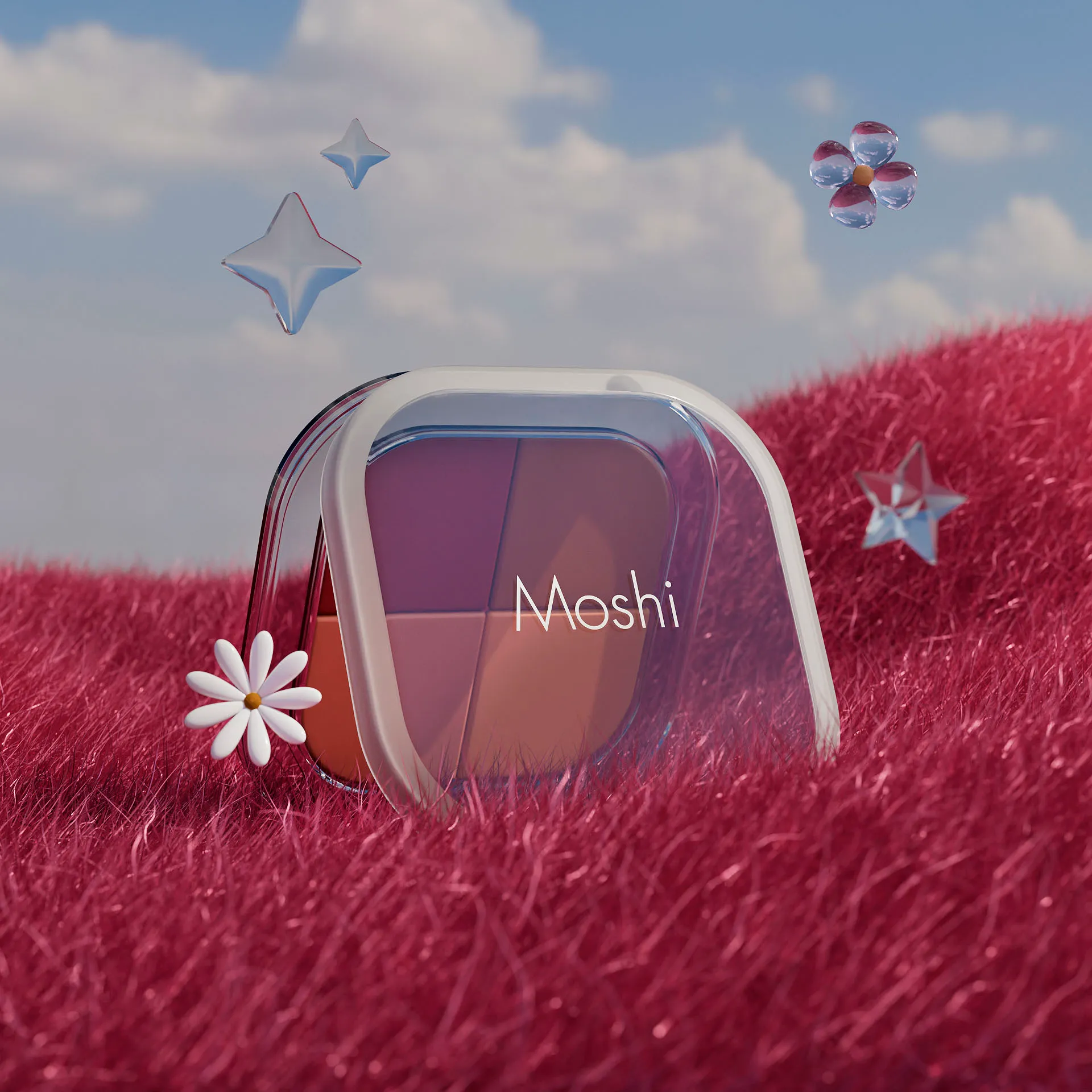
Moshi lives somewhere between reality and imagination. The visual world was imagined as a kind of dream state — familiar objects, soft colours, playful forms and surreal compositions brought together without following the rules of a conventional beauty campaign. The references draw from the optimism and visual language of early-2000s beauty culture, but reinterpret it through a cleaner and more contemporary lens. Rather than building a world around a single aesthetic, the goal was to create a space where the brand could keep changing, playing and evolving.


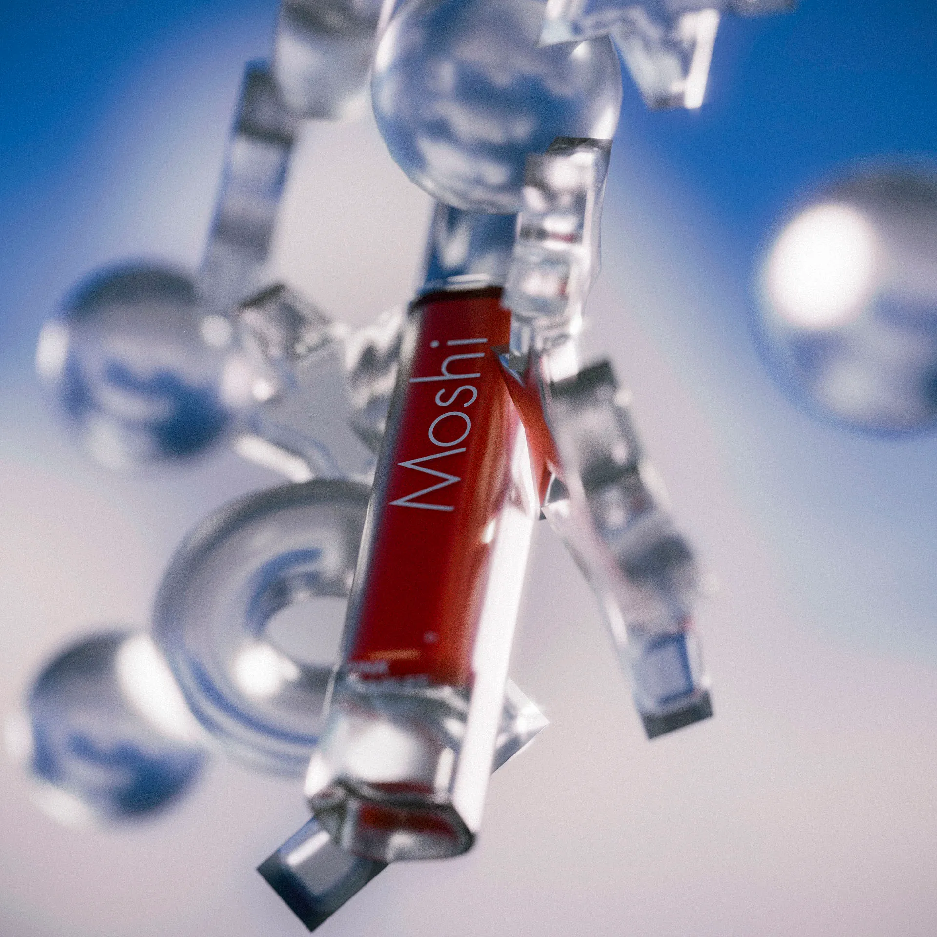
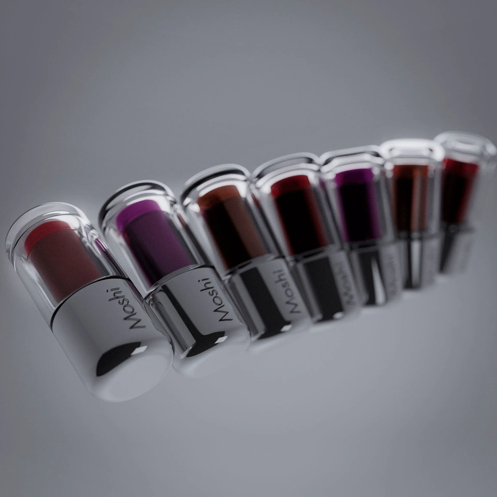
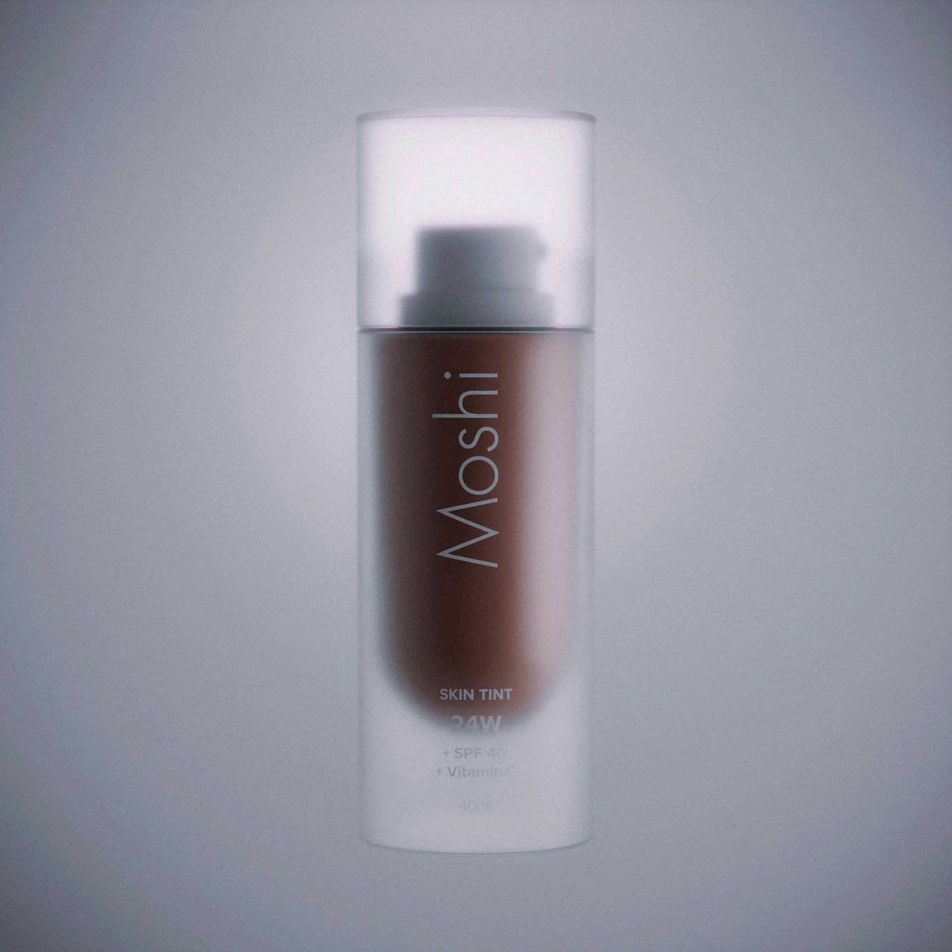
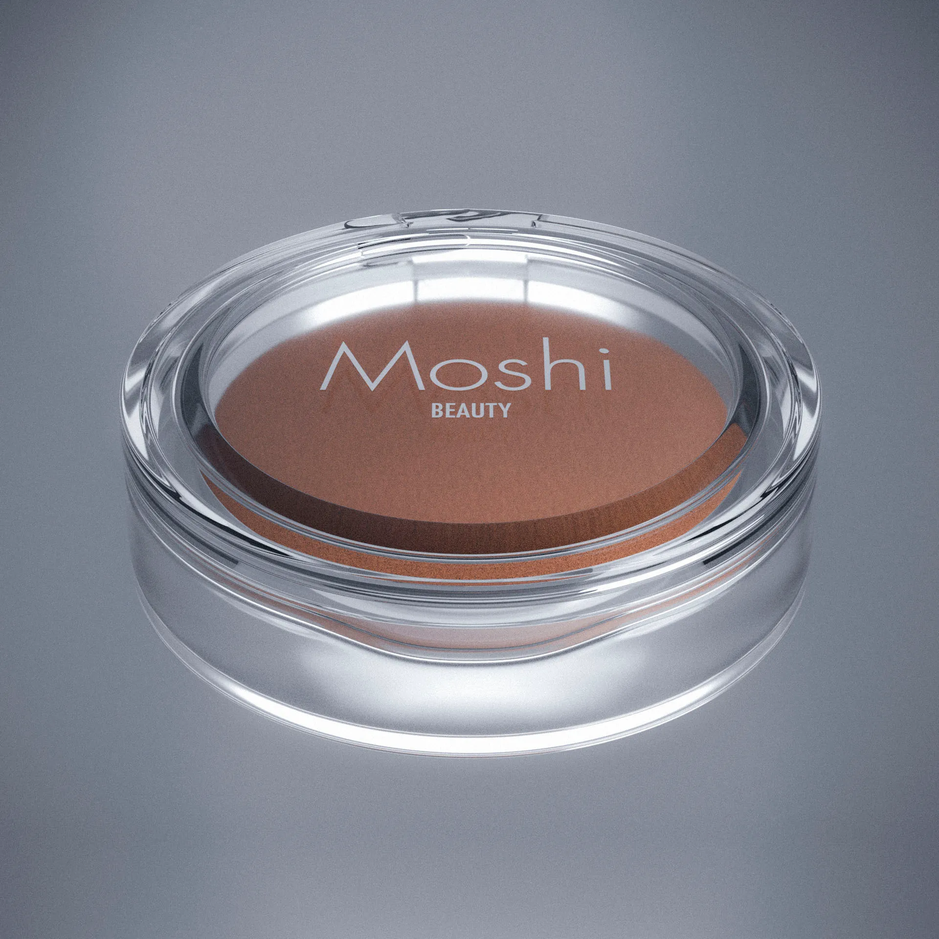
The packaging became one of the clearest expressions of the Moshi language.Transparent containers were chosen to expose the product rather than hide it — turning the object itself into part of the visual identity. The approach draws from the playful transparency, colour and materiality associated with early-2000s beauty, while stripping the language back into something cleaner and more contemporary.The result is packaging designed to feel almost collectible: simple at first glance, but full of small visual details when seen up close.
Every package was modelled and rendered in 3D, allowing the material, transparency and proportions to become part of the design itself.Instead of treating 3D as a final production step, it became part of the process — a way to explore how the identity could exist as a physical object.


The world of Moshi was never meant to stay still. Motion brings the identity, objects and imagery together, turning the visual language into something more expressive and alive.The result is a series of moving compositions designed to feel less like traditional beauty advertising and more like glimpses into the Moshi world.
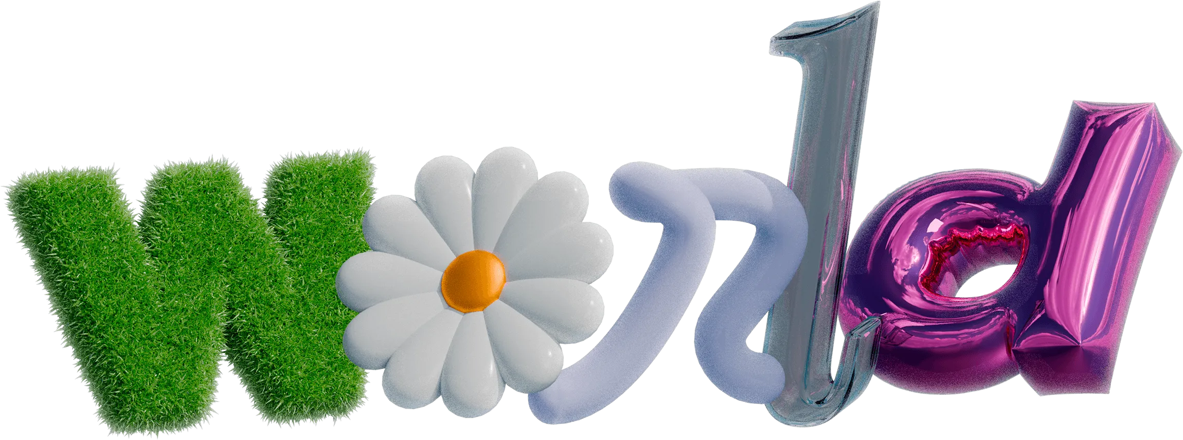
Each sequence blends 2D and 3D animation — a first for this kind of project — combining flat motion design with rendered environments to keep the balloon lettering, packaging and product shots moving as one continuous language. Rather than polished, corporate motion, the pacing stays loose and playful, closer to a dream sequence than a commercial.